Client Stories: Sara & Laurie
Sara and Laurie ooze character as a couple and are such a joy to be around! Outdoorsy, bright-spirited, and with a love of life with their adorable dog Doug.
It was clear their wedding stationery needed to uniquely reflect them.
Living locally, we we able to meet in person to chat through their ideas and build a picture of their vision. From the beginning I knew this was going to be a lot of fun to create!
Capturing the Mood: The Invitation
The first focus was the wedding invitation. Sara had a beautifully clear idea of what she wanted: contemporary yet characterful, with a relaxed, freehand style inspired by her Instagram and Pinterest finds, along with some pieces from the Wilde & Scribe portfolio. All brought together with their chosen navy blue and burnt orange palette - perfect for their winter wedding.
For the front of the invitation, we decided on a simple, hand-painted illustration of the church where they would be married, captured in delicate linework with minimal detail to keep things feeling modern and light.

On the reverse, Sara wanted a collection of small illustrations to accompany the key details—accommodation, travel, guest info etc. to bring the details to life.
Many standard invitations use infographic-style icons for this treatment - we felt we could do better!! Each element was captured in illustrative detail, echoing the broken-line style of the church. It was about striking a balance between function, beauty and personality.

Bringing the Day to Life: On-the-Day Stationery
With the invitations completed and sent, we turned our attention to the on-the-day stationery. This is where their story really came to life in illustration.
Order of Service
We matched the front cover to the invitation, using the church design, and paired this with a new illustration of their reception venue—Wylam Brewery—nestled within the surrounding park on the reverse. To add some extra character and personality, I included a bespoke drawing of Sara, Laurie, and their beloved dog Doug walking toward the venue, an update on their original save-the-date design with wedding-day outfits replacing walking gear. There was no way that Doug could not feature in this set!

Table Plan & Table Names
Their reception seating plan was a personal highlight. With three long tables, Sara and Laurie wanted each one named after a place that held special meaning to them—Newton-by-the-Sea (where they got engaged), along with Jesmond Dene, and Hadrian’s Wall - favourite places for weekends and dog walks with Doug.
I created detailed watercolour paintings of each location for individual table signs, and grouped them together on an A1 table plan, all styled with their signature navy and burnt orange palette.

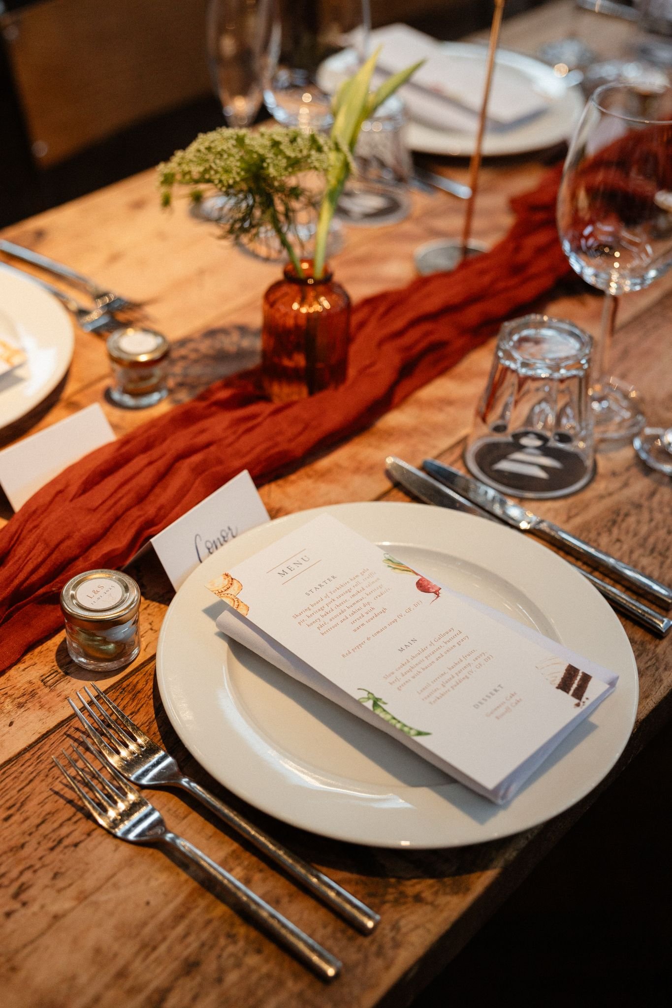
Menus, Place Names & Favours
For the wedding table, I created illustrated menus picking out ingredients from the wedding breakfast. Yes, the iconic pork pies had to feature! As well as their show-stopping frilly Guinness wedding cake. Place names were hand-scribed in modern calligraphy in navy ink, and for their favours, Doug returned once more, this time as a charming linework illustration alongside the couple’s names and wedding date. A perfect personal detail to complete each table setting.
‘‘We had a vision and Rachel absolutely nailed it, her talent and eye for detail throughout the paintings she creates really is second to none. Every element of our wedding stationery was finished to perfection.’’
The Power of Bespoke
Sara and Laurie’s stationery suite was more than just paper goods—it was a deeply personal collection of memories, places, and people (and pups!) that reflected the story of their relationship.
This is what bespoke stationery can do. It brings heart to the smallest of details, and gives your guests something to cherish, not just read.
Planning your wedding?
If this sounds like your vibe, I’d love to hear your story!
Get in touch to begin your own bespoke design journey…
Professional photos courtesy of Rosie Davison Photography